Did you know that color has a big impact on your mood? Knowing what those effects are can be really helpful in selecting paint colors for your home’s interiors. Homeowners frequently take on the task of painting their home and whether it’s one room at a time or tackling the whole house, deciding on colors can sometimes make the start of the project drag on. We’ve been doing some research on the psychology of color and learning more about which colors work best in certain areas of the home and wanted to share that insight with you. In part one, we will talk about the brighter end of the color spectrum and in part two we will cover the neutrals.
Let’s start with the bright colors.
Red.
Red draws attention, creates excitement, raises energy levels, and some say it makes you hungry. It’s even known to raise blood pressure and heart rate! This doesn’t mean that you shouldn’t use it in your home decor but choosing how and where to use it is important. For example, painting a red accent wall in the dining room can work well to invite conversation and stimulate appetites.
Orange.
Orange is another energetic color, which makes it a great color for a home gym. It’s also known to spur creativity, so you may also want to consider integrating it into a craft room, playroom, or home office.
Yellow.
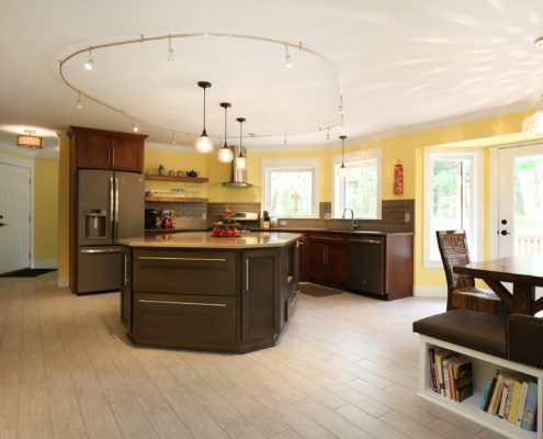
Yellow radiates happiness and warmth, so it’s an excellent option for spaces where you want to create a welcoming environment. This color also reflects light, so utilizing it in small or dark areas can help brighten the space. Kitchens, bathrooms, entryways, and hallways are all great places to use yellow paint.
Green.
The color green is seen more than any other color, particularly in nature, and as such it a very pleasing paint color. Known for its relaxing effects and ability to reduce stress, green is suitable for nearly any space, but it’s ideal for use in bedrooms to create a peaceful and healing environment.
Blue.
Blue is another restful color, known to reduce blood pressure, slow down breathing, and heart rate. This color is recommended for use in bedrooms, bathrooms, living rooms and offices. It’s important to keep in mind the intensity or shade of blue you select can create a different effect, for example, a brilliant blue is dramatic and can create excitement so you probably don’t want to select that for your bedroom.
Purple.
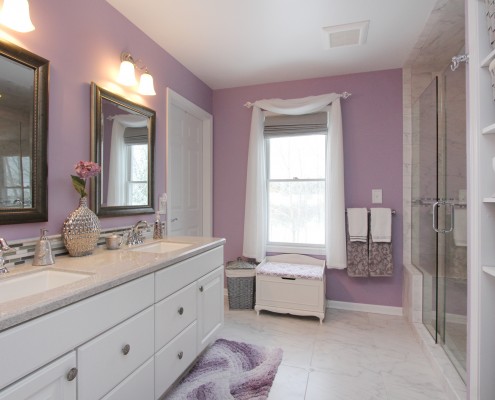
Purple is regal and dramatic. Darker shades bring a sense of sophistication and luxuriousness and would be nice as a painted accent wall in a formal living room. In lighter shades like lavender, it creates a more restful and relaxing mood, which would be nice in a bedroom or bathroom.
To continue reading about the neutral shades of the color spectrum click here for part two.
Topics: Love Where You Live, Thompson Tips, color psychology, paint, thompsonremodeling.com, interior paint, paint colors, Thompson Remodeling